tl;dr
Vertical space is better than horizontal space and you should guard it jealously.
Why it is better:
Most experiences people have on computers don’t need much horizontal space
Most experiences people have on computers are infinitely tall.
What you can do about it:
- Get treestyletab and hide the horizontal tab bar.
⏰🔥💯 on configuration🔥👴🤏
If your job is “using a computer”, you owe it to yourself to spend some time shaping your workspace into your ideal shape. If you routinely get annoyed at something in your workflow that you plausibly could configure your way into eliminating, you really should do that. Make computers do “tasks fit for computers”; don’t do them yourself on the computer’s behalf.
on browser tabs
The browser tab was invented in 1998 for SimulBrowse.
Installer found courtesy of Evolt (later renamed NetCaptor)
Tab behavior and presentation is nearly identical to now. SimulBrowse looked like this:
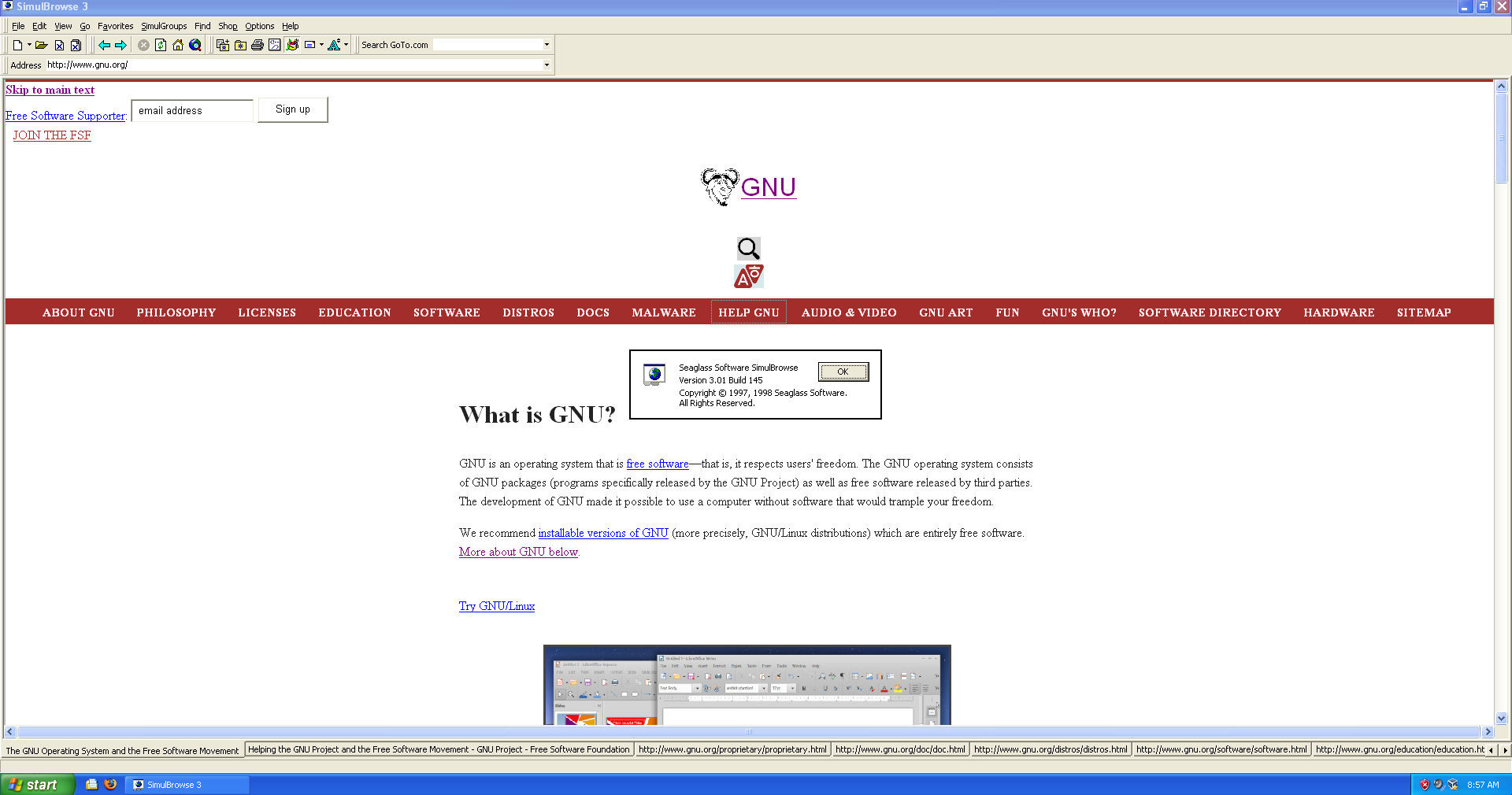
The only significant difference between tab behavior then and now is: in the original version, the tab screen overflow behavior is “the tabs spill off of the side of the screen”. They don’t compress horizontally as you open more of them. You can look at different parts of the tab bar by clicking the ◂ and ▸ arrows found to the right of the tab bar:
Which is way before most people started using tabs. the typical person probably started sometime around Firefox 2-3 (late 2006-early 2008) if they were ahead of the curve, or with the launch of Chrome (mid 2008) if they weren’t Into Browsers enough to have tried early Firefox. In other words, in short, for the overwhelming majority of people, tabs have never changed at all.
—the “tabs compress as you open more of them” behavior was invented. Firefox 1.0 (2004) has this; some earlier browser might also. “No later than 2004” is the last time the tab user experience has meaningfully changed. Two features of browsing that are poorly served by contemporary tabs:
Browsing is hierarchical; you start in one place and you carve a path through hyperlinks, possibly opening a few additional tabs from each page you visit. “Where you accessed something from” is a natural, useful signpost in keeping track of what you’re up to. The tab bar is flat, so it can’t capture this information.
Browsing is about abundance; you’ll probably open dozens of tabs in the course of doing anything deeper than cursory research. Doing so squishes the tabs or drives them offscreen or both; it’s difficult to have a decent quick reference of “what do I have open”. Some examples:

thirtyish google chrome tabs Thirty tabs open in chrome: perhaps in the moment you can mostly keep track of what each thing is based on the favicon and first two letters and relative location on the bar?*

fortyish google chrome tabs Forty tabs: you get favicons and relative locations. nothing else
🖛 Lemma: the horizontal browser tab bar is a historical accident and doesn’t scale well with heavy use. 🖚
on horizontal and vertical space
Vertical space is nearly arbitrarily valuable. Most of what people do on computers is browse endless feeds. How much feed you can skim at once is mostly bounded by how tall the viewport can be, which is bounded by the screen resolution minus any operating system and browser cruft.
To take it a step further: how much you can skim at once is actually bounded by your eyeballs. Adding more pixels etc doesn’t help if you’re saturating your eye already.
The activities that aren’t browsing endless feeds are still mostly vertically constrained. Programmers generally limit themselves to 80ish characters per line, so any one view in their text editor or IDE doesn’t benefit from being any wider. File/project explorers and in-window terminals/debugger consoles can generally be moved to the sides if they aren’t already there by default.
Regardless of what you’re up to, giving yourself more vertical space to do it in will probably make the experience better.
🖛 Lemma: getting rid of the horizontal tab bar and repurposing its space might be nice. 🖚
Horizontal space is considerably less valuable. I see three reasons for this:
- Human horizontal vision is wider than the vertical vision.
You can fit more things in it, so a unit amount of it is less precious.
- Many activities are chat apps. Chat apps are thirsty for vertical space and are borderline indifferent to horizontal space.
Each message in a typical chat app is allocated at least one vertical “line” regardless of its length. The horizontal space of that line is filled with the message. If it’s a short message, the rest of the horizontal space is left unused. If the message is too long to fit on one line, it gets word-wrapped across however many lines it requires.
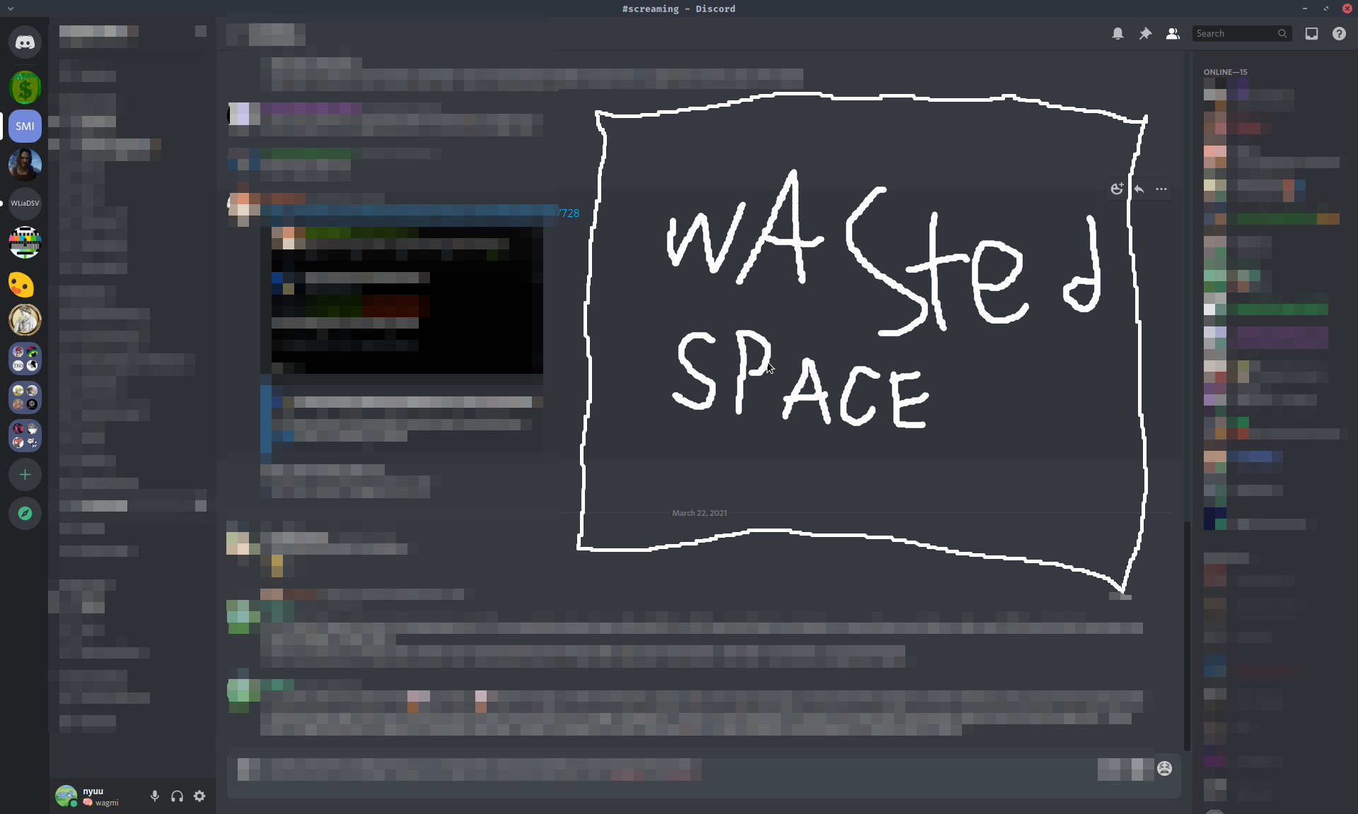
Most chat conversations word-wrap very well. Most of the messages are way shorter than one “typical screen-length line”, so there’s lots of unused space after the lines. Consider the following anonymized discord conversations, presented in portrait and landscape view.
One of these screenshots was taken on my landscape-oriented 1920x1200 monitor:
The other on my (identical but rotated 90°) portrait-oriented 1200x1920 monitor:
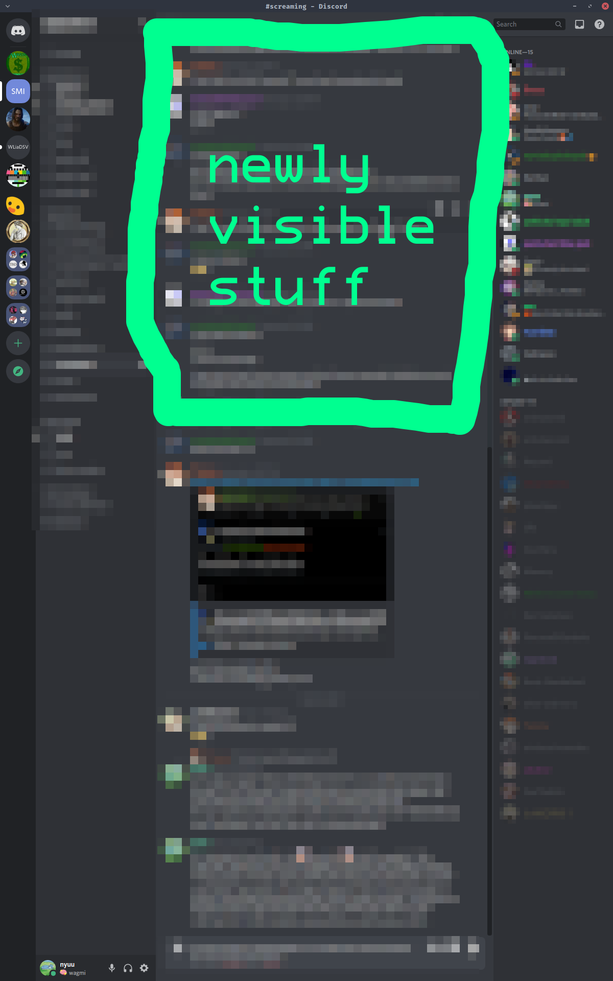
The latter is able to show about twice as many lines (use the black box present in both images as a landmark if you’d like to check) despite having the same pixel count. This is because it doesn’t have to spend tons of screen space on “the non-content between the end of the message and the right edge of the screen”.
- Activities that aren’t chat apps often limit themselves to relatively narrow widths and that’s probably for the best.
If you have an ultrawide monitor you probably never open up a plaintext document in fullscreen with no wordwrap and then read the document using the entire monitor. That monitor is useful for multitasking and movies, but you would probably not display or read a book on that monitor as one giant window. It isn’t suited for “read from left to right, then at the end go all the way back to the left and down by one, then repeat”. The distance between the start and the end of the lines is too large for this to be a good experience so people don’t do it.
Websites figure you don’t want to do that and won’t let you. Below is an (anonymized) screenshot, this time of what I see when I visit twitter. This is as viewed on a typical 1920x1080 monitor:
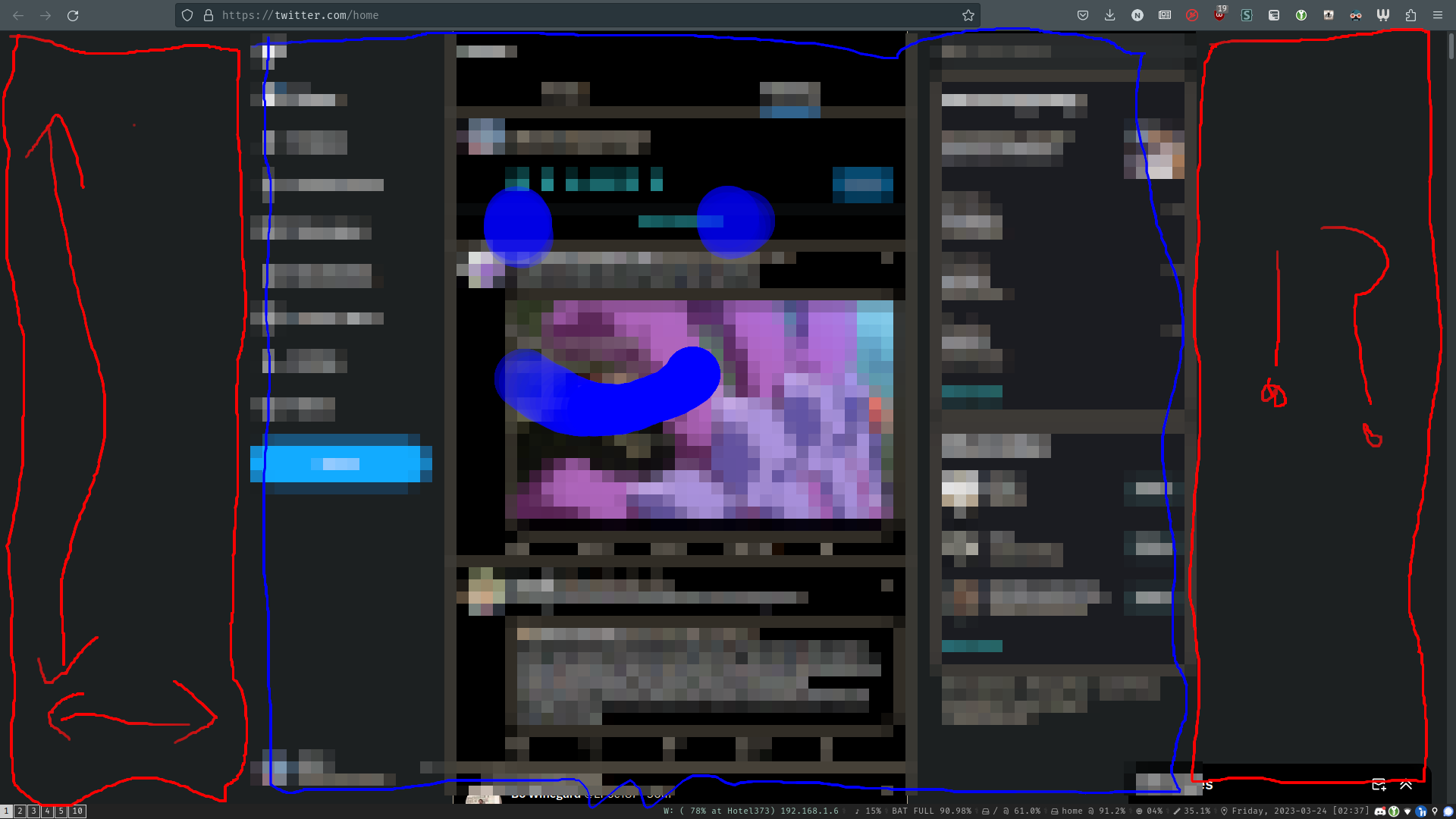
a third of the viewport is dedicated to horizontal padding!
Twitter doesn’t want you to view it in ultrawide. It responds to being fed more space by wasting more of it. It is pretty typical in this regard.
Reddit is an endless feed. Adding more horizontal resolution to the viewport doesn’t allow it to show you more posts since it can only show one post per row. Nor does it allow you to view more comments at once since reddit also softwraps the commments to ~100 characters per line. Reddit is, in effect, a SPA designed for very tiny screens. Most websites, static or not, follow similar design principles.
🖛 Lemma: a lot of people have horizontal regions of screen space that usually aren’t being used for anything in particular. 🖚
thus: 🌲 treestyletab 🌲
Check out my UI; it makes such elegant use of space by putting a tab tree in a sidebar and not having a tab bar at all:

Eschewing an address bar is a bit too radical for my tastes so “just browse in fullscreen mode” isn’t quite right. If I really want to hide the tree, F1 toggles showing/hiding it.
Giving a robust tutorial for replicating this arrangement would involve writing way more, but the bullet point version is short. To get this UI, use Firefox, with:
the treestyletab extension (provides the tree)
the
toolkit.legacyUserProfileCustomizations.stylesheetsflag enabled inabout:config(makes it possible to hide the tab bar)You’ll need to restart Firefox for this change to take effect. You’ll also need to restart for any changes in userChrome to take effect.
the following rules in
{FirefoxProfileFolder}/chrome/userChrome.cssto actually hide the horizontal bar:If you’re following along and can’t find the folder: go to
about:supportand check the entry for “Profile directory” for its location.
#main-window[tabsintitlebar="true"]:not([extradragspace="true"]) #TabsToolbar > .toolbar-items {
  opacity: 0;
  pointer-events: none;
}
#main-window:not([tabsintitlebar="true"]) #TabsToolbar {
    visibility: collapse !important;
}

#sidebar-box[sidebarcommand="treestyletab_piro_sakura_ne_jp-sidebar-action"] #sidebar-header {
  display: none;
}
Most people use Chrome, which so far as I can tell doesn’t allow modifying the UI to hide the original tab bar. People have made Chrome extensions that supplement the bar with a shortcut-invokable tree popup, which isn’t what I’m used to, but has its own kind of charm. Regardless: consider demanding a better tab experience from your favorite browser. We can do better than The Bar.